About concept
It all started with the thought of a joke about doctors' incomprehensible handwriting. At this point, I thought it would be cool if all prescriptions were typed only in font. The problem turned out to be broader than that, because even the choice of font can be very wrong.
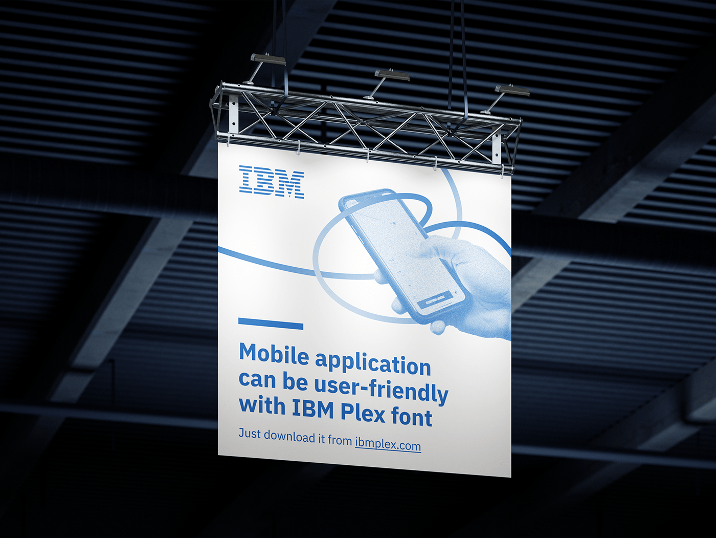
IBM Plex is a quality font that fits perfectly with the technological spirit of today. It could be the new world standard for typeface. Its accessibility would have solved a lot of problems and made the world a little bit better.
It was important to convey that typeface affects the way we see and feel a product. This is best conveyed through tactile contact with our hands. To do this, I took photographic content where the product is in the hands.
The sense of tactility was enhanced by making the lines in the graphic touch the product and the hands, embrace them.
IBM Plex makes communication clearer, opens up new possibilities in communication, so the campaign slogan - It can be!
So, yes. It can be better!